Happy.is
Identity & corporate website
Agency
Happy
The Client
Happy was a digital studio founded by Nicholas Callaway in 2012, focused on creating interactive lifestyle apps that blended design, technology, and storytelling. Based in New York City, the company developed high-quality, visually rich experiences for iOS devices, including its flagship product Martha Stewart CraftStudio, which allowed users to design and personalize digital crafts with ease and creativity.
The Ask
Happy approached me to help evolve their brand identity. The strategy centered on presenting technology in a friendly, approachable way, emphasizing apps designed to spark joy and creativity. Even the name reflected this idea, with “app” embedded inside “happy” to highlight the brand’s focus on creating personal, emotionally resonant digital experiences.
The Client
I helped lead the creative direction of the Happy brand. While the logo had already been created by the team’s creative director, I expanded the system around it—defining color, typography, illustration, and UI. I also guided the development of the flagship website, working closely with engineers to ensure the parallax experience delivered on the brand’s joyful, approachable vision.
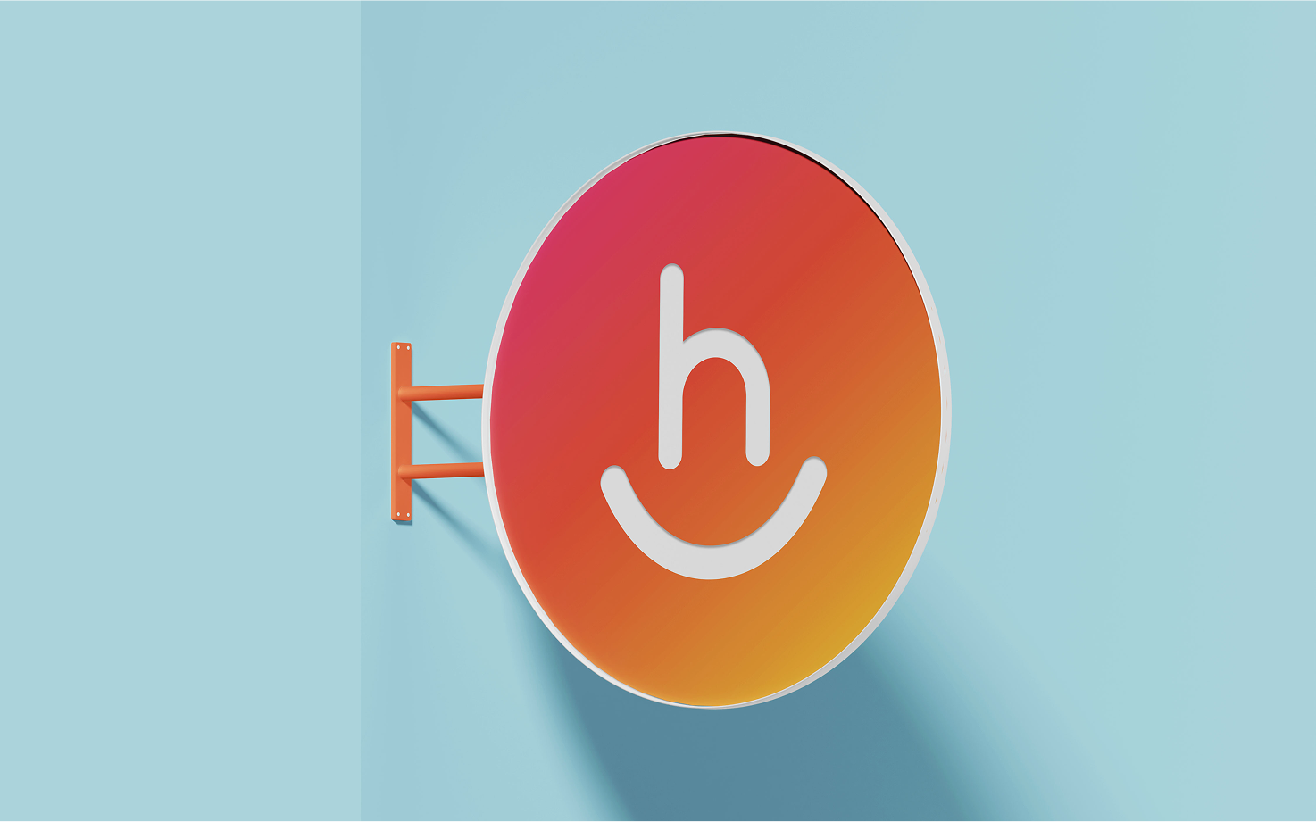
While the logo was already developed by the team's creative director, it became the foundation for the entire visual identity. Its playful, welcoming design set the tone for every brand element that followed, serving as the core inspiration for extending the system across digital and marketing touchpoints.
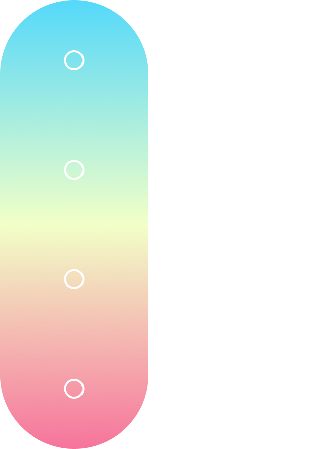
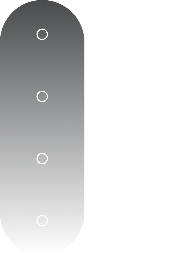
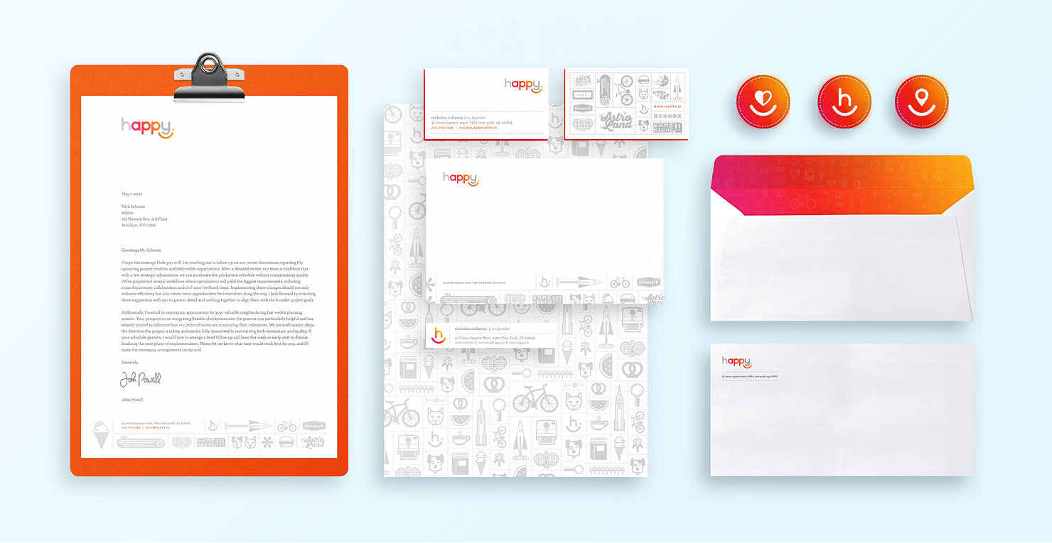
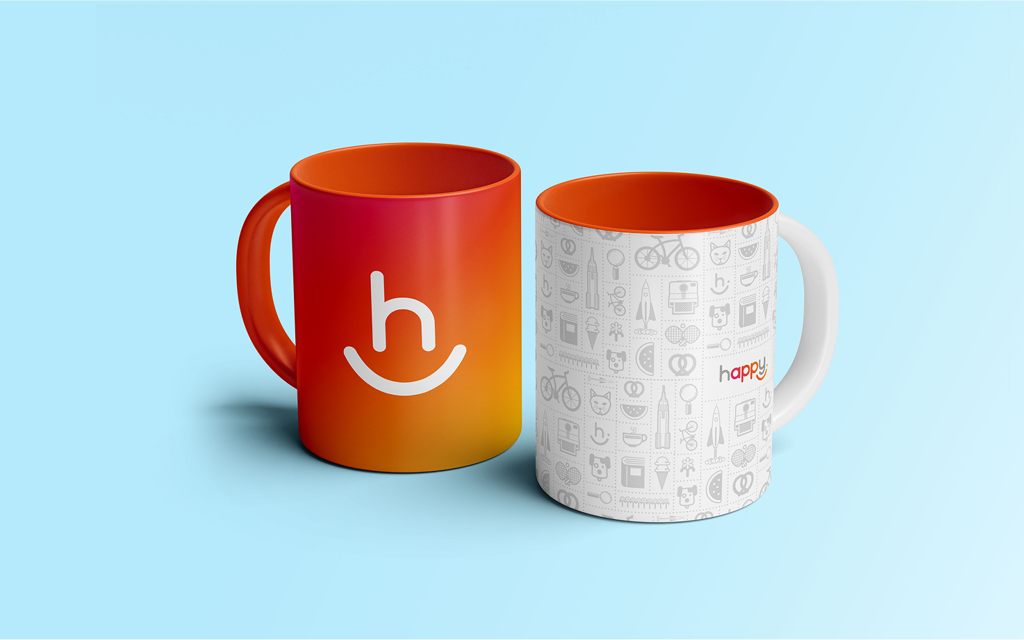
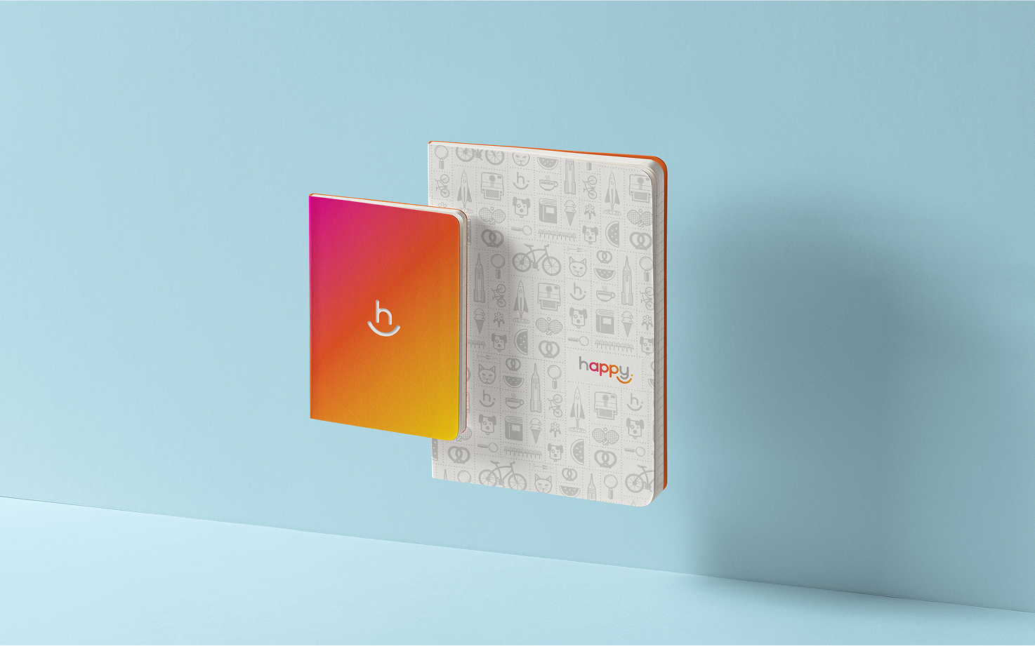
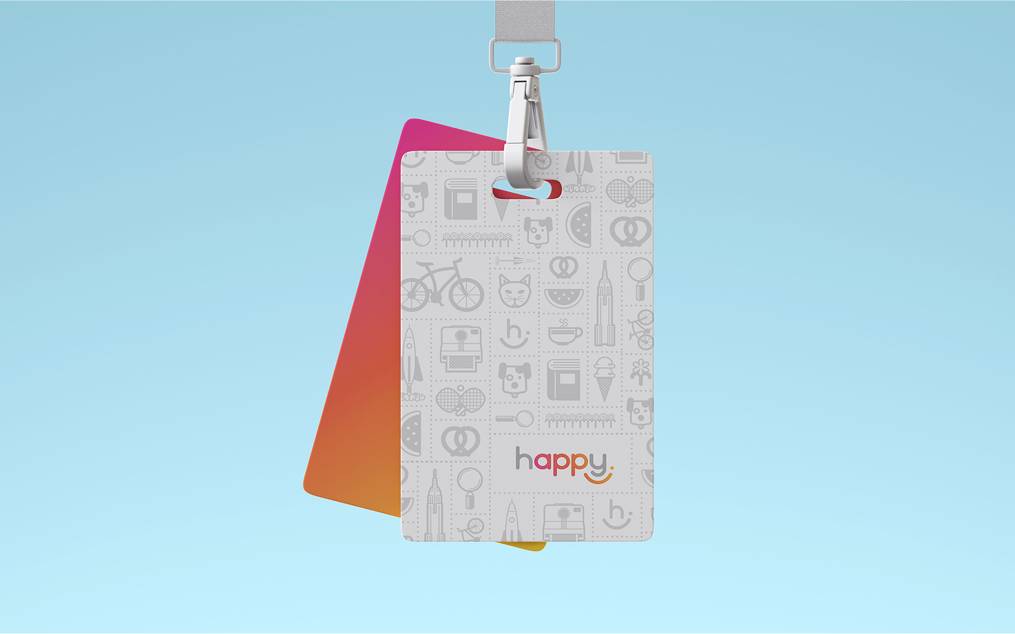
We built a flexible color system around three gradients and a solid. The Hibiscus–Sunflower gradient served as the primary palette, with solids pulled from it as needed. A Sky–Pinkberry gradient offered soft pastel options, while greys provided neutral support. The Happy solid orange was used as the main accent when limited to solids.

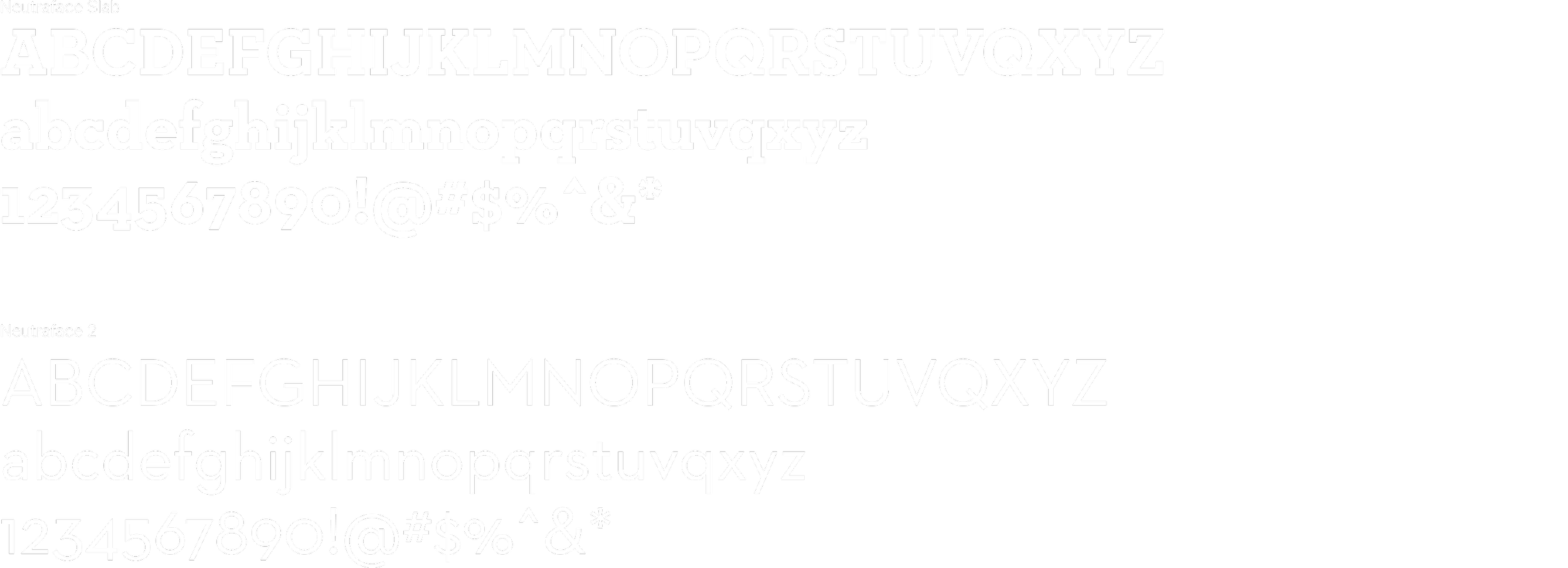
Neutraface Slab and Neutraface 2 Text were chosen to reinforce the brand’s approachable, joyful tone. Their clean, modern forms balanced friendliness with clarity, making them ideal for both user interfaces and broader brand communications.
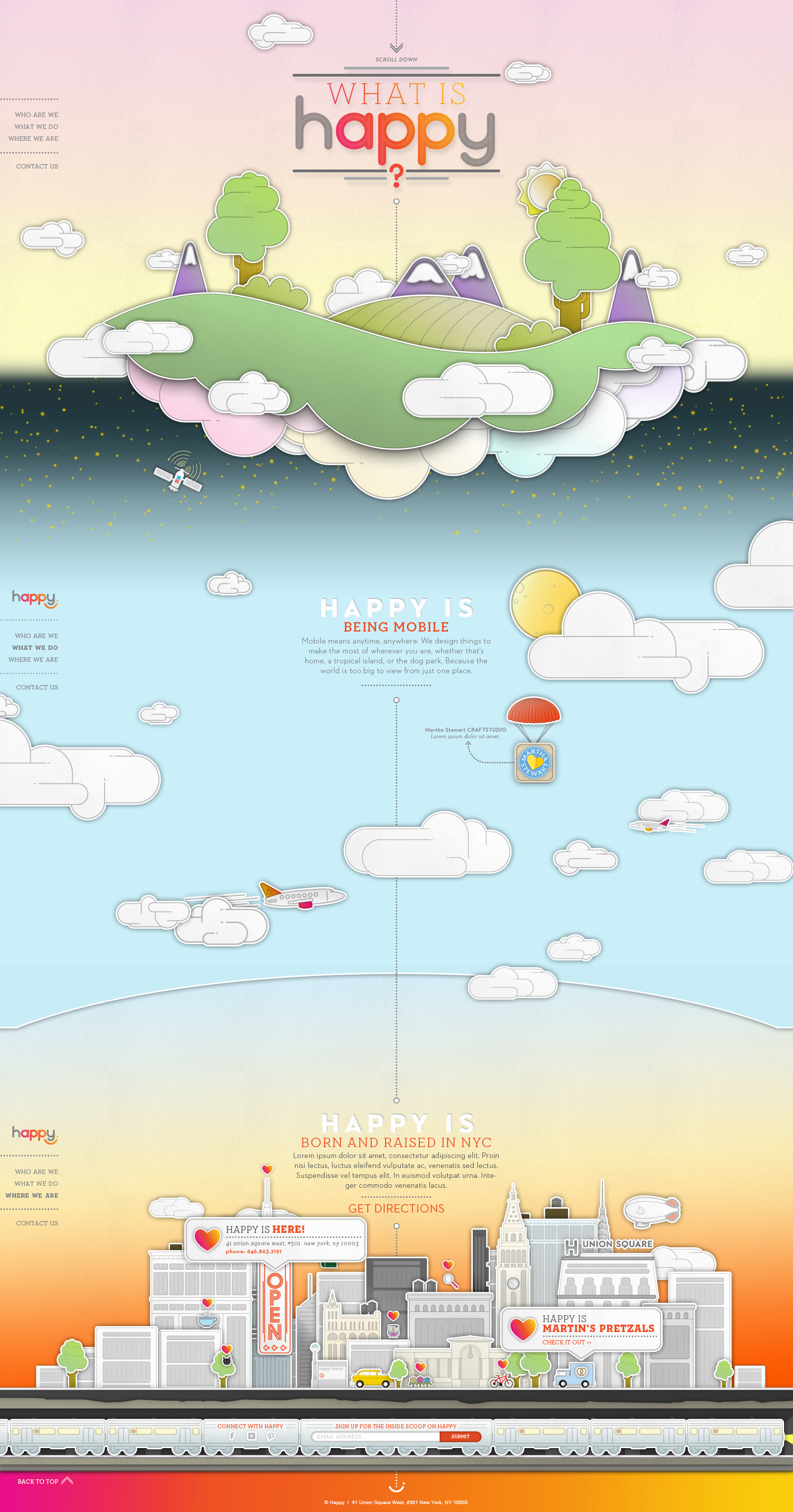
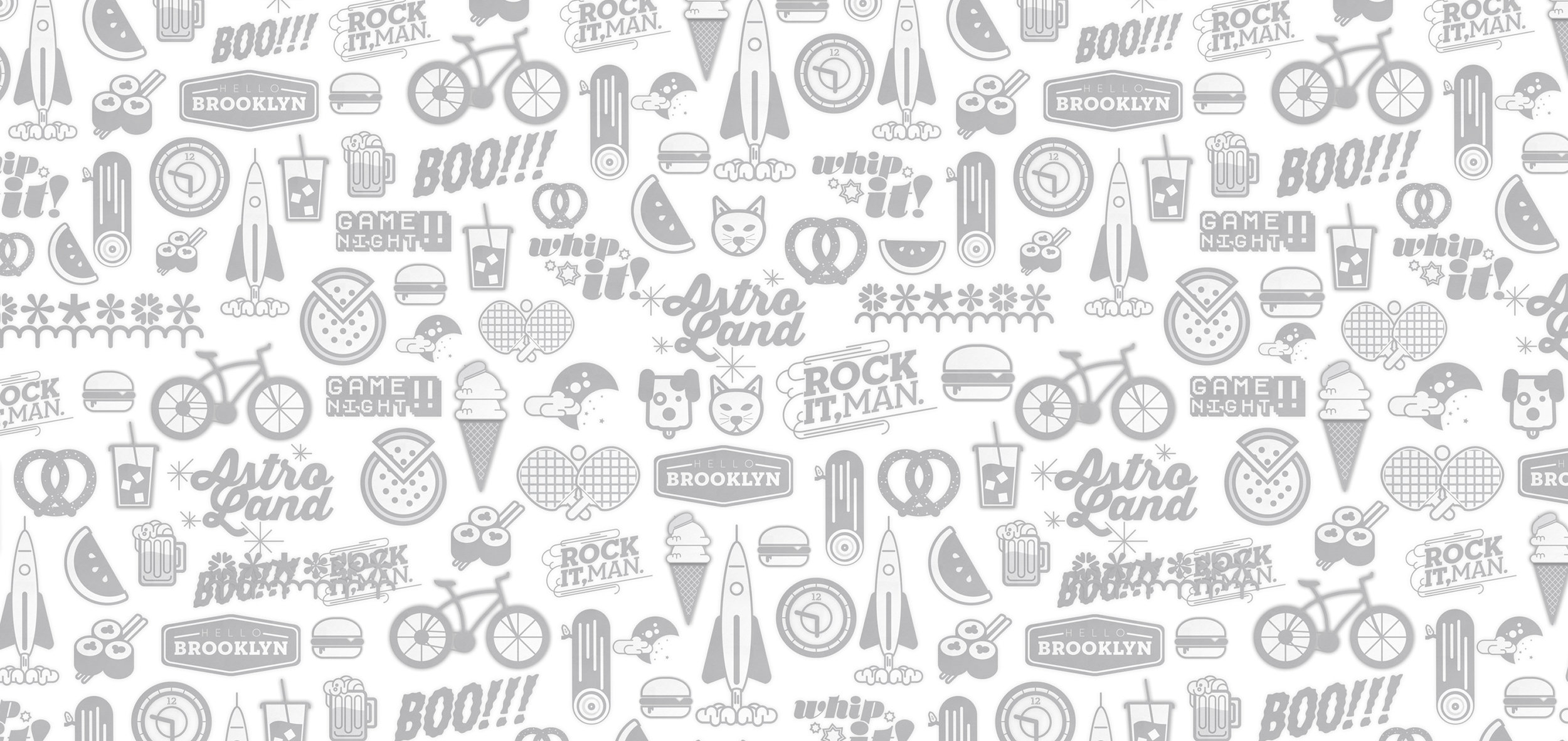
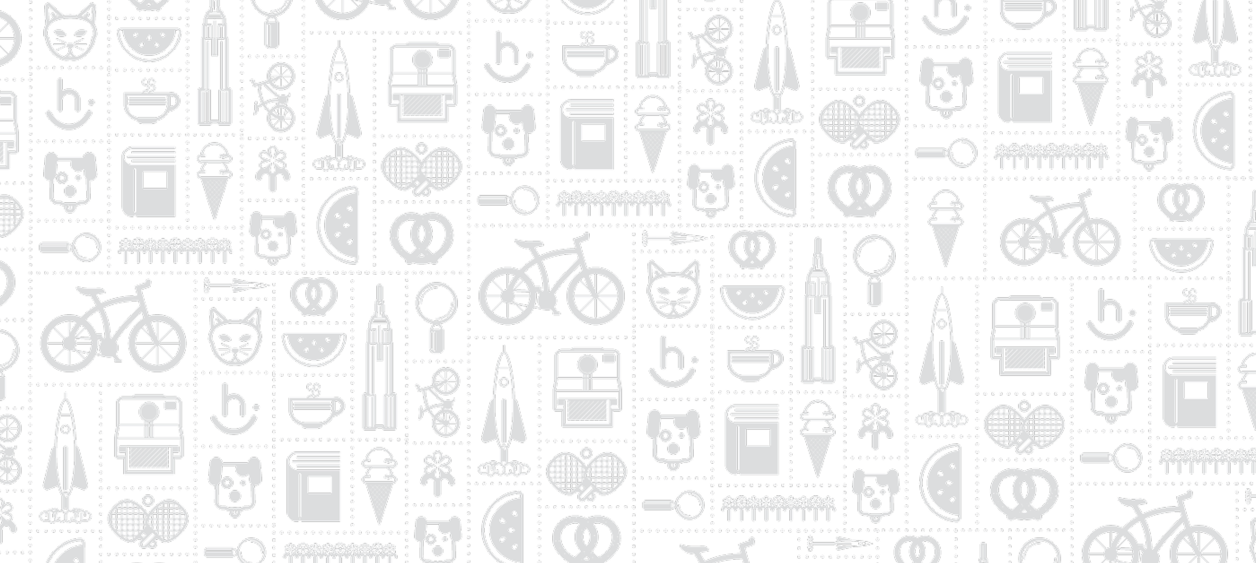
The Curio Cabinet illustration system was created to support the brand’s playful, approachable tone. Using bold lines and simple forms, the icons were designed for versatility, scaling seamlessly across digital, print, and environmental applications while maintaining clarity and energy.
The combination of the color system, dynamic gradients, Curio Cabinet illustrations, and approachable typography formed a cohesive brand that radiated positivity and creativity. Every element was carefully crafted to feel bright, friendly, and energetic, reinforcing the idea that technology could be both joyful and emotionally engaging at every touchpoint.
The flagship piece of the Happy identity was the website—a rich, parallax long-scroll experience filled with playful visual treats and animations. Designed to bring the brand’s spirit to life, the site served as an engaging platform to tell Happy’s story in a dynamic, memorable way.