Nardello & Co.
The Client
Nardello & Co. is a global investigations firm specializing in anti-corruption, fraud, litigation support, and reputational due diligence. Their expert team handles complex cases in areas like digital forensics and financial investigations. Recognized for excellence, the firm has supported high-profile cases like FTX’s collapse and Purdue Pharma’s bankruptcy.
The Ask
Nardello & Co. sought a rebrand that authentically reflected the caliber of their investigations. Aiming to break away from the clichéd imagery often associated with private investigation firms, they desired a fresh, sophisticated identity that embodies their commitment to transparency, thoughtfulness, and integrity.
The Role
As the creative lead, I guided the project from concept to launch, shaping the overall vision and execution. I served as the client’s day-to-day creative partner while collaborating closely with strategy and development teams to define and realize the creative direction.
Identity Foundations
Nardello wanted to refresh its logo while maintaining a sense of continuity. Working with the team, we focused on simplifying and modernizing the mark while preserving its classic feel. A fresh typeface with subtle custom touches was introduced, and the ampersand was refined for a cleaner, crisper look, achieving a careful balance between tradition and modernity.
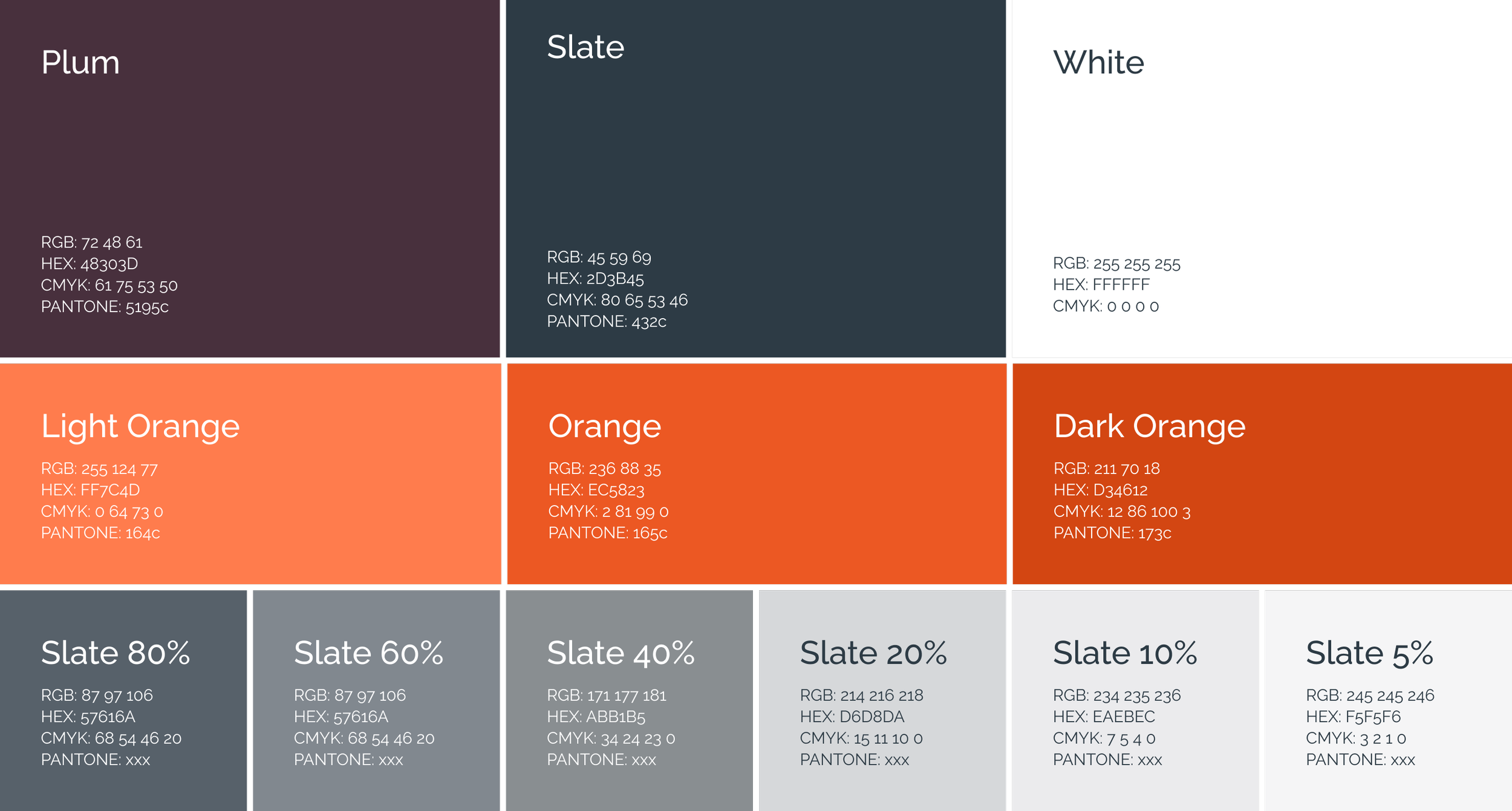
Nardello was keen to retain their signature orange, so we leaned into it and expanded the range. The color palette was updated with a set of greys and a complementary deep purple. We also refined the palette to meet WCAG accessibility guidelines, ensuring the design remained both visually engaging and inclusive.
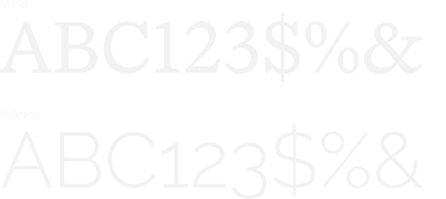
The typefaces were carefully selected to support the refreshed logo and align with the updated brand strategy. We struck a balance between modern sophistication and timeless elegance, using typography to reinforce the firm’s professional, high-caliber presence.
Imagery
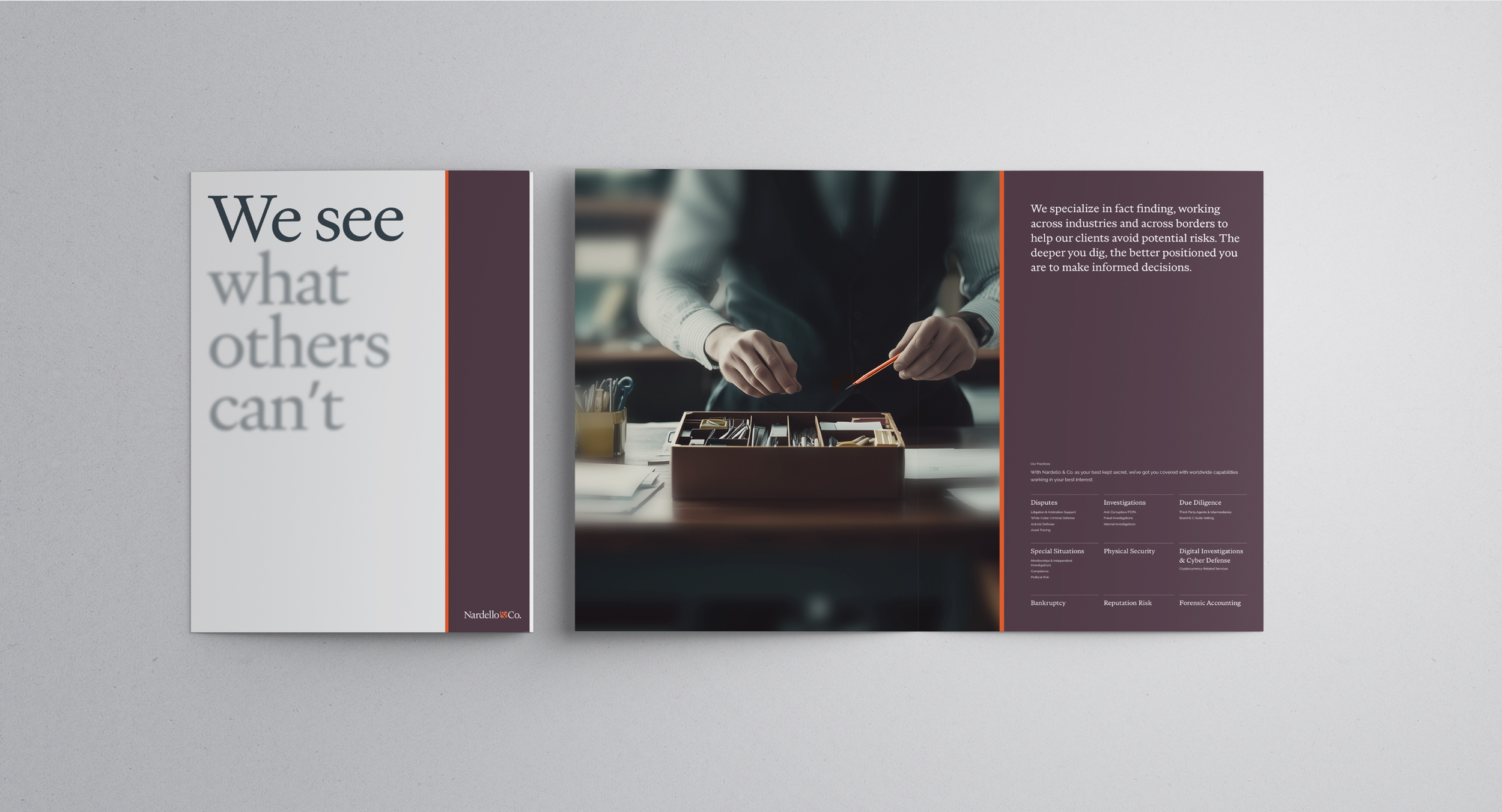
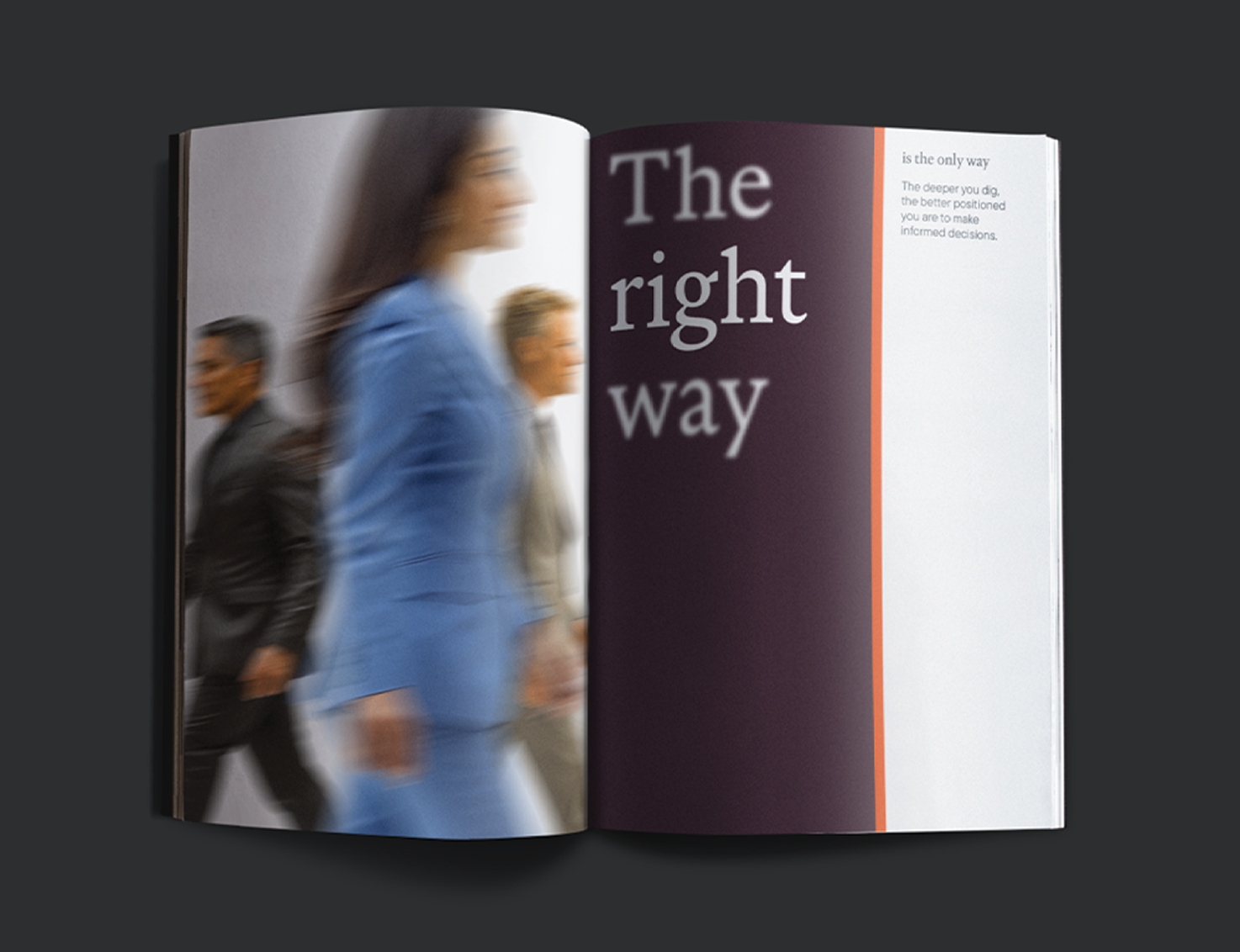
Nardello wanted to feature people prominently in their imagery while avoiding the use of specific employees. To address this, a strategy was developed using MidJourney to generate a large set of AI-created hero images, enhanced with subtle, hand-applied motion blur. This approach introduced dynamic movement to the brand while maintaining the level of anonymity the client desired.

In addition to the hero images, we wanted a visual representation of Nardello’s core capabilities. A large set of AI-generated images was created, featuring people while maintaining anonymity. Each image highlights one capability, focusing conceptually on hands at work to convey the expertise behind the firm’s services.


Secondary Graphics
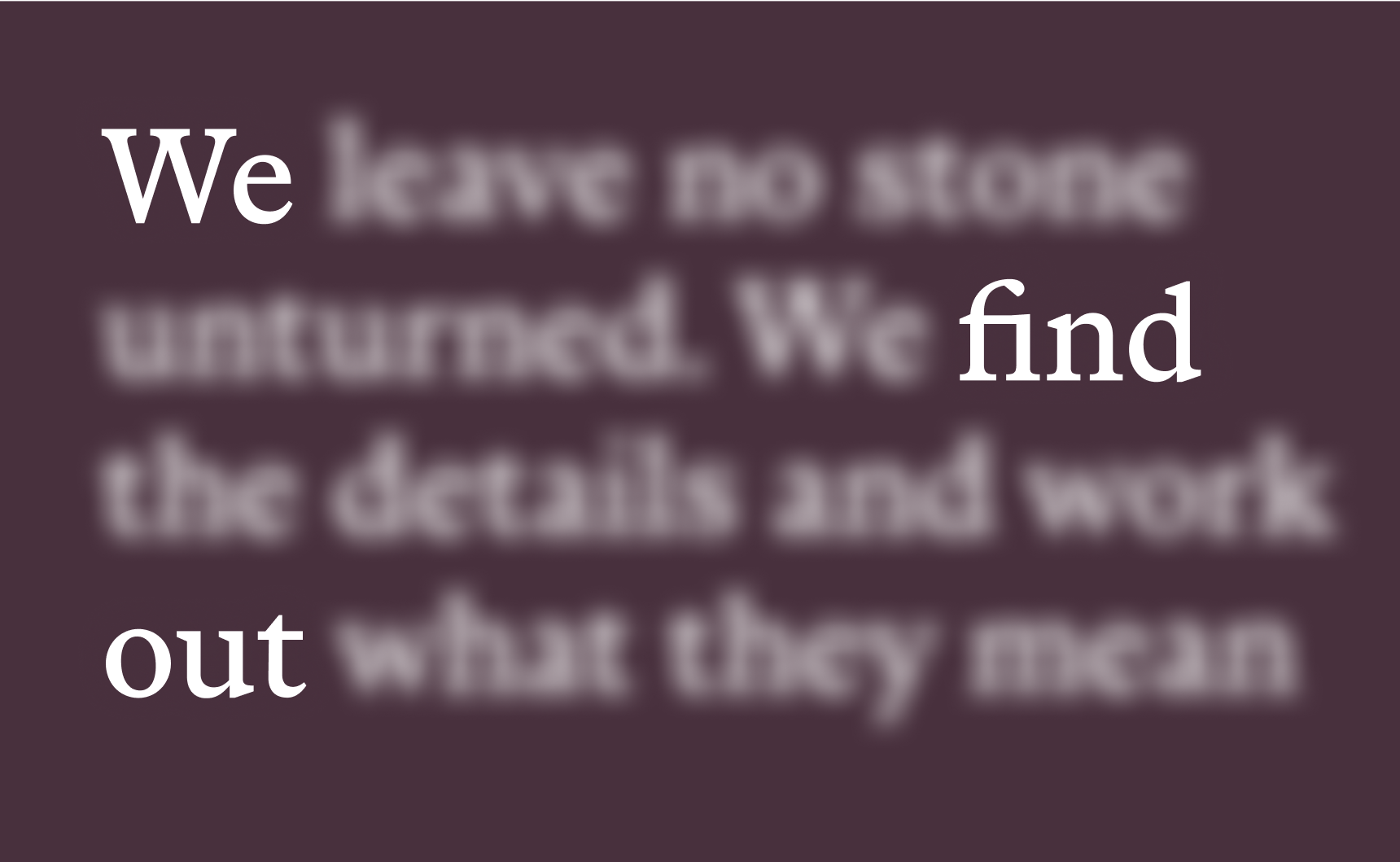
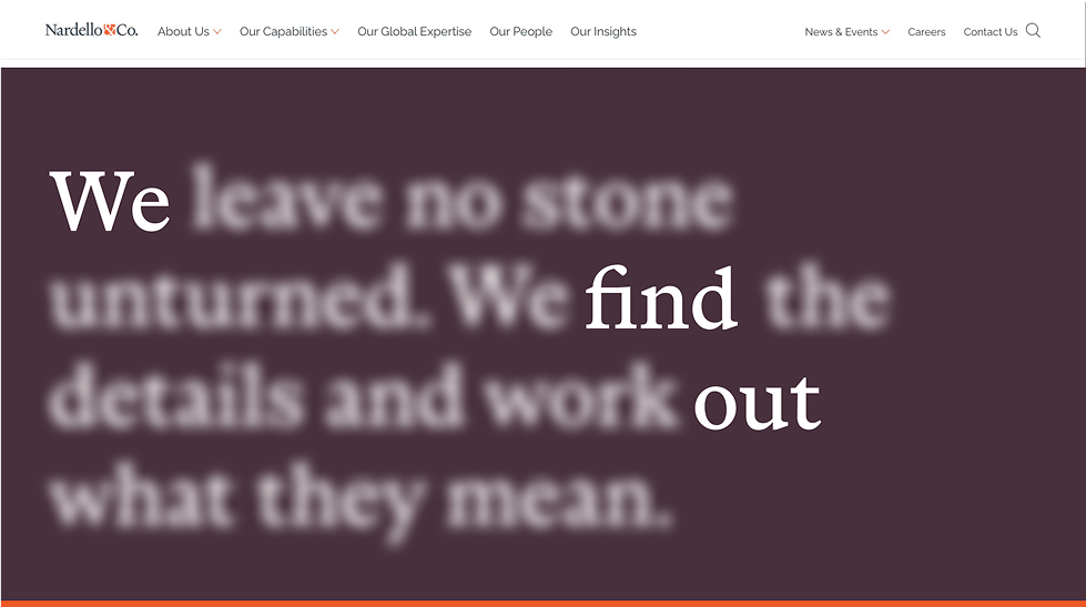
Building on the strategy used for the hero images, a secondary graphic style was created by subtly blurring specific keywords within a statement. Whether emphasizing a single word or revealing a hidden message, this technique visually communicates Nardello’s investigative expertise.
A custom set of icons was developed to visually codify Nardello’s blog content. Each icon represents a distinct content category, allowing readers to quickly identify the type of article at a glance.
Website
With a complete overhaul of both UX and content strategy, the site was fully aligned with the updated brand. The result is a redesigned experience that is easier to navigate and reflects Nardello’s values. The transformation delivers a dynamic, engaging site that embodies the professionalism and high-caliber expertise of Nardello & Co.


Collateral direction

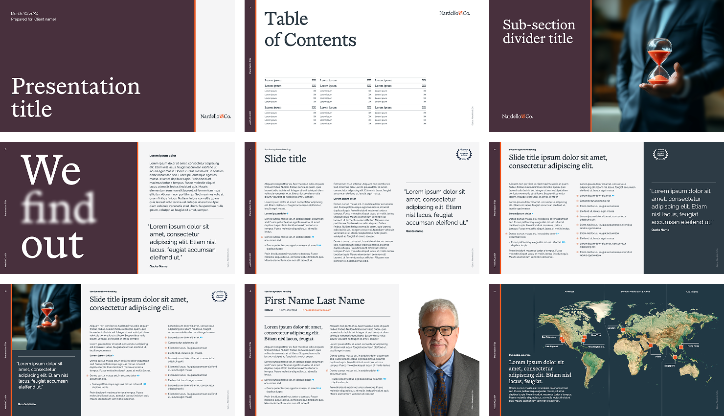
Powerpoint Templates